IELTS Task 1 - Pie Chart: USA - Sources of Energy
The given graph shows the main sources of energy for USA in 2000 and 2010.
Write a report for a university lecturer making comparisons where relevant and report the main features.

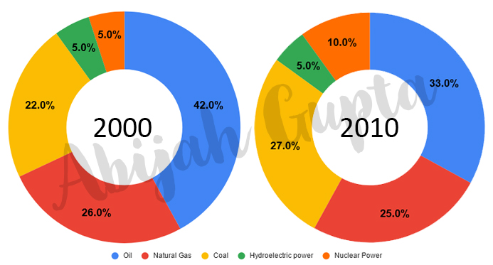
The two pie charts portray five energy sources in the USA between 2000 and 2010. The data is calibrated in percentage.
At first glance, it is clear that Oil was the primary energy source in both years and that coal, natural gas and hydroelectric power remained in much the same proportions. On the other hand, there was a dramatic rise in nuclear power, which doubled its percentage over a decade.
Oil remained the most significant energy source, even though the percentage decreased from 42% in 2000 to 33% in 2010. Coal was the second-largest source of energy in 2010, increasing its proportion to 27% from 22%. Natural gas, the second-largest source, remained relatively consistent overall.
Similarly, there was no change in the hydroelectric power, which remained at 5% of the total energy provided. Nuclear power had the most significant change in 2010 where it doubled as compared to 2000.
Overall, Oil remained the dominant energy source in both years.
Click here to go to the main IELTS Writing Menu


