IELTS Task 1 - Pie Chart: Population, Resources and spending
The given graph shows the global spending and population along with resource consumption.
Write a report for a university lecturer making comparisons where relevant and report the main features.

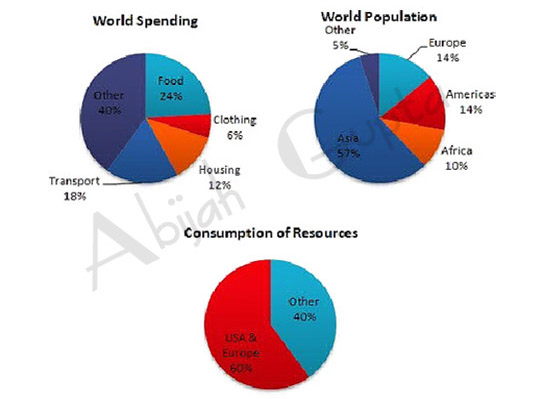
The three pie charts illustrate the world spending, world population and the consumption of resources. The data is calibrated in percentage.
At first glance, it is observable that people spend most of their income on other items at 40%, followed by food at 24%. Transport and housing are the subsequent major expenses at 18% and 12% respectively. Only 6% of income is spent on clothing.
Moving further, it is evident that 57% of the world population is Asian. Europe and the Americans account for nearly 30% of the total, while 10% live in Africa.
Even though the Asian population account for over half of the world's population, it is notable that USA and Europe alone consume a staggering 60% of the world's resources while the Others consume merely 40%.
Overall, the significant expenditure is on food with Asia having the highest population. USA and Europe have the lion's share of the resources.
Click here to go to the main IELTS Writing Menu


