IELTS Task 1 - Pie & Line Chart: Food budget on restaurant and home cooking
The given graphs show the average family's percentage of food budget spent on restaurant meals in different years along with the number of meals eaten in fast food restaurants and sit-down restaurants.
Write a report for a university lecturer making comparisons where relevant and report the main features.

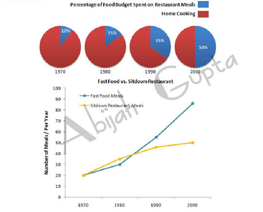
The pie chart and the line graph reveal the percentage of food budget spent on restaurant meals, home cooking and the number of meals per year from 1970 to 2000. The data is calibrated in percentage.
Overall, the percentage of the average family's food budget spent on restaurant meals steadily climbed. Families spent just 10 percent of the food budget on restaurant meals in 1970, which increased to a staggering 50% by 2000.
In 1970, families ate the same annual meals at fast food and sit-down restaurants. Two decades later, fast food restaurants served more meals to families than sit-down restaurants. In 2000 the percentage of fast food meals reached the pinnacle at almost 90%, while the ratio for sit-down restaurant meals was approximately half.
Overall, home cooking has steadily declined, and fast food meals have become the staple choice.
Click here to go to the main IELTS Writing Menu


